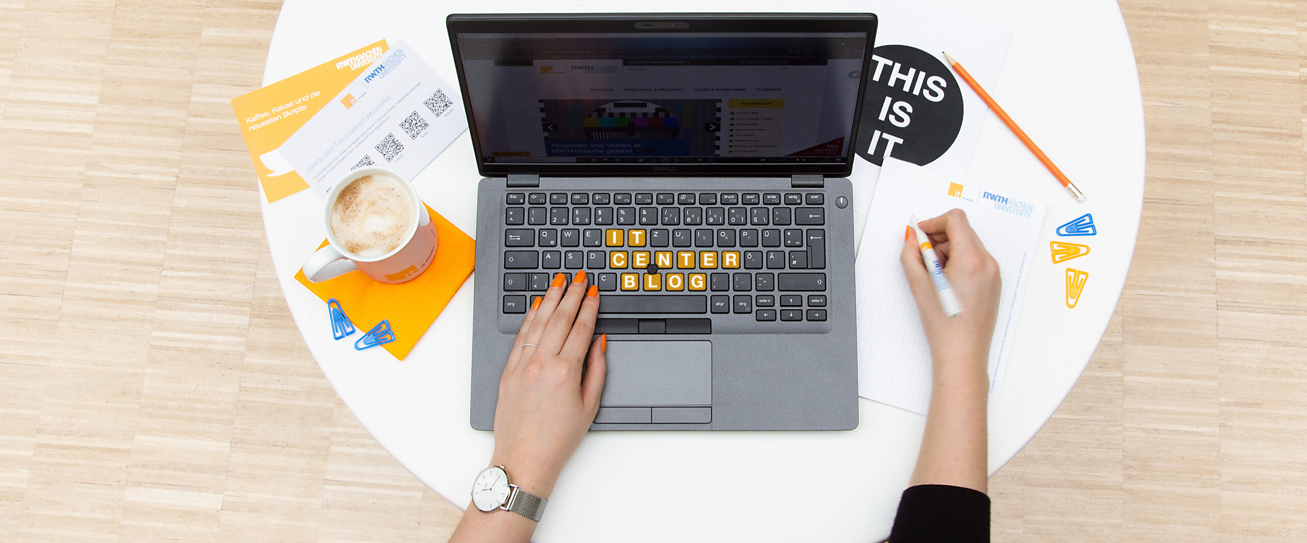
The IT Center has a new key visual. The key visual, which we developed for marketing purposes, will be seen in many places in the future, in addition to the IT Center logo.
Whether on merchandise, the web or on print products – the key visual is versatile. In addition to the common logo, the key visual allows a clear identification of the IT Center in the RWTH Aachen University logo system.
The key visual supports brand communication as a pattern that is quickly, sustainably and effectively associated with the IT Center. It also helps to visually communicate the IT Center as a service provider and partner and increases recognition value.
Creation of the Key Visual
Since the IT Center is the central IT facility of RWTH Aachen University and is responsible for IT support of university-wide processes, the development of the key visual focused on both people and technology.
The IT Center defines itself not only as a service provider, but much more as a partner to its clients. This is reflected in the continuous development of the service offering and research collaborations, which is captured and visually communicated by our new key visual.
One inspiration was the robot of the RWTH, on which we based the IT Center key visual. Of course, we also followed RWTH’s corporate design guidelines when creating it.
If you have any ideas or wishes for the use of the new key visual, whether in print, online or for merchandise, please feel free to leave your comments. And who knows, maybe we can realize your ideas.
Responsible for the content of this article is Morgane Overath.


Hi!
Good Information, I want to learn the current topic. Expecting more,
Thank you,
Hello Divya,
Thank you very much for your positive feedback and your interest in the topic!
Kind regards,
the IT Center Blog Team